King Arthur Baking
Tools
Figma
Adobe Suite
As the Lead UX/UI designer for this project, I was responsible for spearheading the overhaul of the member portal, focusing on creating a responsive, accessible, and user-friendly interface.
Contributions
Roles
Product Design
Lead UX Design
Challenge
The main issues with MedMutual's previous portal included:
Complex User Journeys: Users found it difficult to navigate between policy management, claims, and support. This led to frequent customer support queries.
Mobile Responsiveness: The portal’s interface was not optimized for mobile devices, resulting in poor user experiences for those trying to access it on-the-go.
Accessibility Gaps: The portal lacked proper accessibility features, making it difficult for users with disabilities to interact with the platform.
Notification Overload: Users might easily become overwhelmed by too many notifications, leading them to disable the feature.
Personalization: Each user has different needs and preferences, so the notifications had to be relevant and personalized.
Timeliness: Notifications had to be sent at the right time to be useful without being disruptive, particularly for urgent matters like claims updates or payment reminders.
MedMutual tasked us with solving these problems by delivering a modern, intuitive portal that provided a seamless experience across devices.
App review prior to engagement - August 2021
Solution
Design Process
Through OpenForge, I redesigned the portal with a user-first approach, creating a streamlined interface for both desktop and mobile users. We focused on:
Responsive Design: Ensuring optimal performance across devices, enabling users to manage their policies on-the-go.
Simplified Navigation: Reducing the steps needed to access vital information such as claims and policy details.
WCAG-Compliant Accessibility: Making the portal fully accessible for users with disabilities.
Personalized Alerts: Each member received notifications that were tailored to their specific policies, claims, and upcoming payments. This ensured that users only received updates that were directly relevant to them.
Interactive Notifications: We designed notifications to allow users to take immediate action from their device, such as reviewing a claim status, paying a bill, or accessing policy documents directly from the notification itself.
Smart Frequency Control: To prevent notification fatigue, we built an algorithm that prioritized the most critical notifications and batched non-urgent ones into daily or weekly summaries. This allowed users to stay informed without feeling overwhelmed by constant alerts.
User Preferences: Members had control over their notification preferences through the portal. They could easily toggle notifications on or off for certain categories, such as policy updates, claims, or general health tips, ensuring they received only the information that mattered to them.
Wireframing and Prototyping:
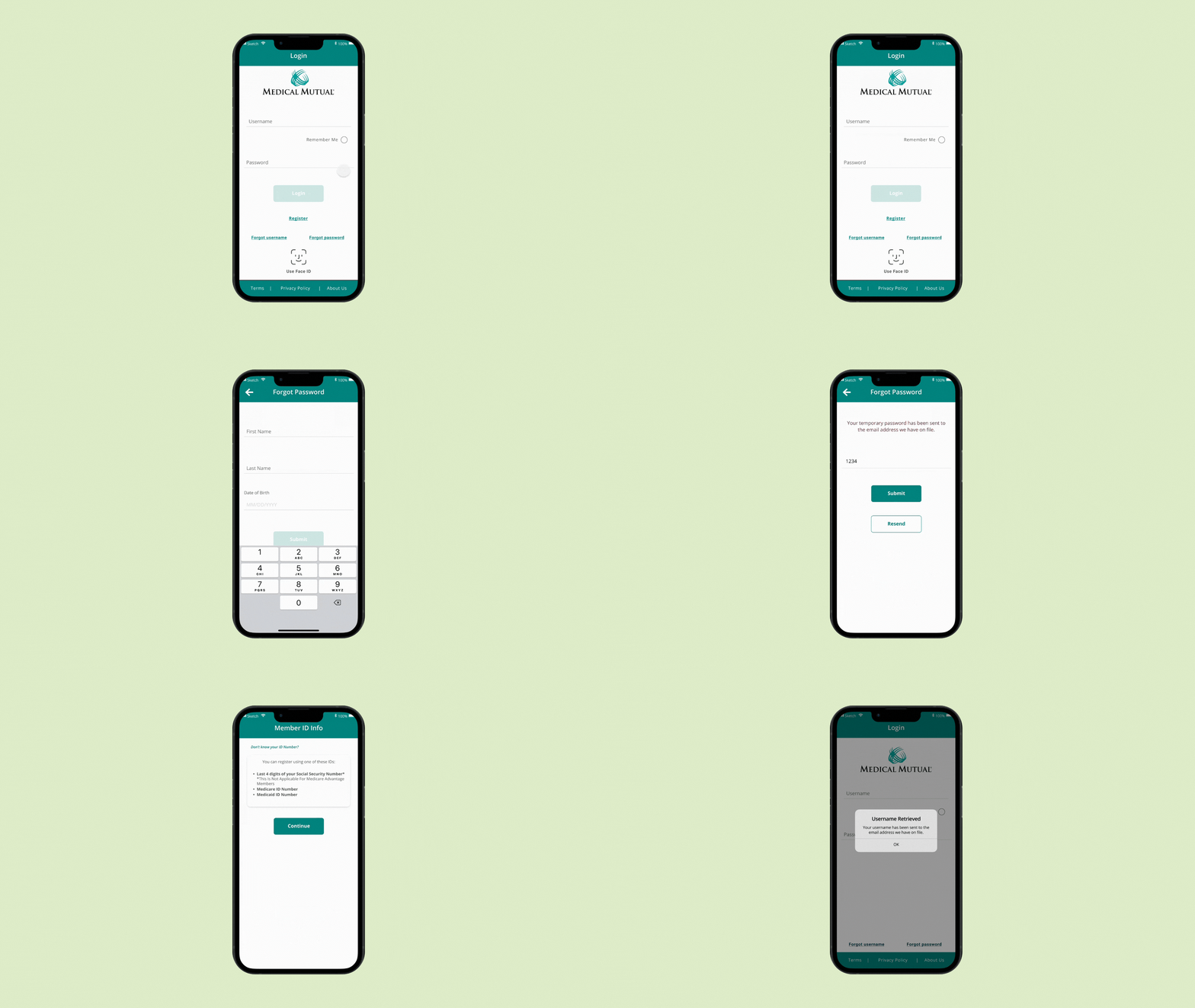
Based on research findings, we created wireframes that reimagined the layout of the portal, focusing on ease of use and logical content structure. We also developed prototypes for both the portal and push notification system to visualize how these components would work together.
Testing: The wireframes and prototypes were tested with our internal team and stakeholders, which allowed us to refine the navigation flow and test various notification types, including claim updates, payment reminders, and policy change alerts.
High-Fidelity Design:
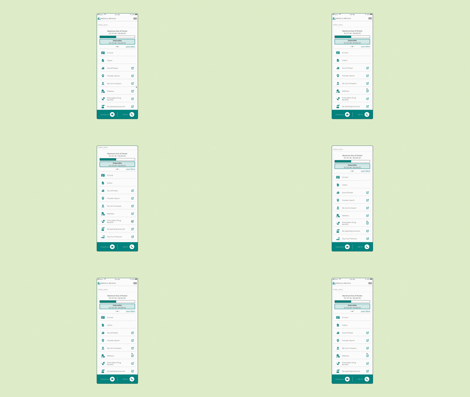
After validating the structure and interaction models through testing, we designed high-fidelity mockups. These were crafted with a modern, clean aesthetic that adhered to MedMutual’s brand guidelines while ensuring optimal usability.
Mobile-First Approach: Given the importance of mobile access, we followed a mobile-first design strategy, ensuring that the portal was optimized for smaller screens without compromising functionality.
Visual Consistency: The high-fidelity designs maintained a consistent look across all devices, with clear hierarchies, intuitive icons, and easy-to-read typography.
Push Notification Integration:
We implemented a robust notification system that provided personalized, event-triggered alerts for members. The design included interactive notifications that allowed users to act directly from the notification—such as reviewing a claim or making a payment—without needing to log in.
Testing Notifications: We tested different frequencies and types of notifications with users, making sure that they were timely, actionable, and didn’t overwhelm the user. The notifications were customizable, allowing users to control the type and frequency of alerts they received.
Development Handoff and Collaboration:
Throughout the project, we worked closely with the development team to ensure the designs were implemented seamlessly. We provided detailed design specifications and assets, and conducted regular reviews to ensure the integrity of the design across devices.
Impact
The redesign resulted in increased member engagement, reduced customer service tickets, and a more intuitive platform that empowered users to manage their healthcare with ease.
Reviews on the app went from 2.1 stars to 5.4 stars after the redesign engagement.
Review July 2024


